What are HEAT Scores?

|
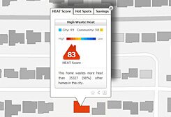
HEAT Scores are ranked numbers between 100 and 0 (representing hot to cold) that allow you to meaningfully compare the waste heat of one or more houses (shown on a HEAT Map), with all other mapped houses in your community and city. In this example, a HEAT Score of 83 is colored red indicating that this is a relatively high energy home. A relative descriptor is also associated with each HEAT Score, which for this house (83) would state "High Waste Heat". A description noting percentage of houses in the evaluated area (i.e., city, etc) that waste more heat than the defined house is also provided along with its HEAT Score. For example, the house in Fig 11 wastes more heat than 98%* of all other houses in the evaluated area. |
| Fig 11. Example of High Waste Heat |

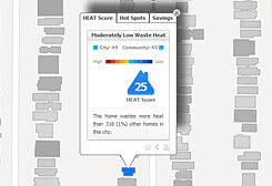
Fig 12. Example of Moderately Low Waste Heat
|
If the HEAT Score is lower, for example a value of 25 (Fig 12), this means that this is a low energy home. As a result, the HEAT Score is colored blue, with a corresponding relative descriptor of "Moderately Low Waste Heat". Even though the HEAT Score for this house is 25, it wastes more heat than only 1% of all other houses in the evaluated area (i.e., city). HEAT Scores can also be calculated for communities and cities. A city HEAT Score is calculated based on the average HEAT Score of all houses in the city, while community HEAT Scores are calculated based on the average HEAT Score for all homes in each community. *The reason this value may be different than its corresponding HEAT Score is because in an evaluated area (i.e., city), there may be different numbers of houses corresponding to each HEAT Score rank (100 – 0), that when cumulatively added and defined as a percent of the total number of houses in the entire city, do not represent the same percentage as their HEAT Score. |